
Design and Research for Flytaxien Application
My fellow students and I decided to contact firms for collaboration on our final project exam for 2023. Flytaxien (soon called Fast Travel) was kind to let us design their new application for passengers. At gardermoen they have machines for ordering taxis, and they have an application for taxi drivers.
The company’s idea for the application for travelers was to include all taxi companies in Norway in one application, but they had not a lot of research on their new user target. Apart from this, we was given free rein, and was thinking that if we manage to successfully rebrand and design this app, the company would potentially get more customers and increase their success as a company.
We took on the challenge of making an user centric application with an excellent user experience from scratch. Beginning with our own user research and ending with recommendation for an update on our own newest high fidelity wireframes.
Project details
Time
5 weeks
Team
3 students
My roles
Literature research, Survey, Interviews, S.W.O.T & visual audit, Mapping and data analysis, Ideation sessions, Personas, Scenarios,
IA, Flow Charts, Wireframing low, mid & high fidelity, Design system, Accessibility, Prototyping & Usability testing.
Method
Design thinking
Tools
Figma, Figjam, Google Docs, Sheets & Forms
We used the design thinking process to empathize with users, defining problems, ideating potential solutions, prototyping, and iterating based on user feedback. Moving back and forward into these phases throughout this whole project allowed us to continuously refine and improve our final product. The purpose is to create innovative and user-centric designs, for a excellent user experience!

Methodology
Research methods
Literature review
Articles: 34
Survey
Paticipants: 100

Interview
Paticipants: 6

Competitor analysis
Bolt, Taxifix
& Norgestaxi
Empathize
Data analysis
Affinity and empathy mapping
Empathy mapping helped us create primary and secondary persona later on.
Our research from interviews was used for this mapping technique.

Affinity mapping was done with facts from literature, survey and interviews, providing us
with great insights and solutions when creating this application.

Define
Armed with fresh insights from our research, we proceeded to shape our problem statement. In formulating this statement, we employed various effective techniques, including the 5 Why's and How Might We questions.
Additionally, we arrived at a visionary statement to provide further guidance throughout the project, ensuring we stay on course. These statements serve as invaluable compasses, steering us towards success at every step.
Define

Problem statement
People who travel avoid using taxis because they are often cancelled or are delayed. If we can develop an application that includes all taxi companies and provide information, it would positively impact our travel options because more taxis would be available, fewer cancellations and the travelers would experience consistency and being informed.
It would also benefit the "Fast Travel" company, because more people would have a better experience traveling with taxis.

Vision statement
Our vision is to revolutionize the way people travel by developing an advanced application that seamlessly connects travelers with reliable taxi services. By integrating all taxi companies and providing real-time information, we aim to create a future where cancellations and delays are a thing of the past.
Our solution empowers travelers with consistent, informed, and hassle-free transportation options, enhancing their overall travel experience. Through this innovative platform, we aspire to foster a world where individuals can confidently rely on taxis, unlocking new possibilities for convenient and efficient journeys. Together, we are shaping a future of reliable and accessible transportation for all.
Personas
We made both primary and secondary persona. Our primary persona is the traveler that would use our application.
While our secondary persona represents the drivers who are an important customer for the company. By including drivers, we gain a broader insight when making decisions.
Both personas were necessary to empathize with all consumers of Fast Travel. We want to provide a comprehensive understanding and facilitate the identification of solutions that meet everyone's needs more effectively.

Define
Scenarios

Scenario as well as personas would help us empathize even more with our users. Any potential issues or areas for improvements would be identified and we get a better understanding of our users. This would allow us to take more human-centered design decisions.
Define
Divergent thinking
Divergent thinking was employed during the ideation phase to stimulate the creation of a broad range of innovative and unconventional ideas.
This method is enabling exploration of multiple possibilities and facilitating creative problem-solving.
Establishing a safe place was important for success.

Brainstorming
Be creative.
Come up with as many ideas as possible.

Low-fidelity wireframes
Ideate
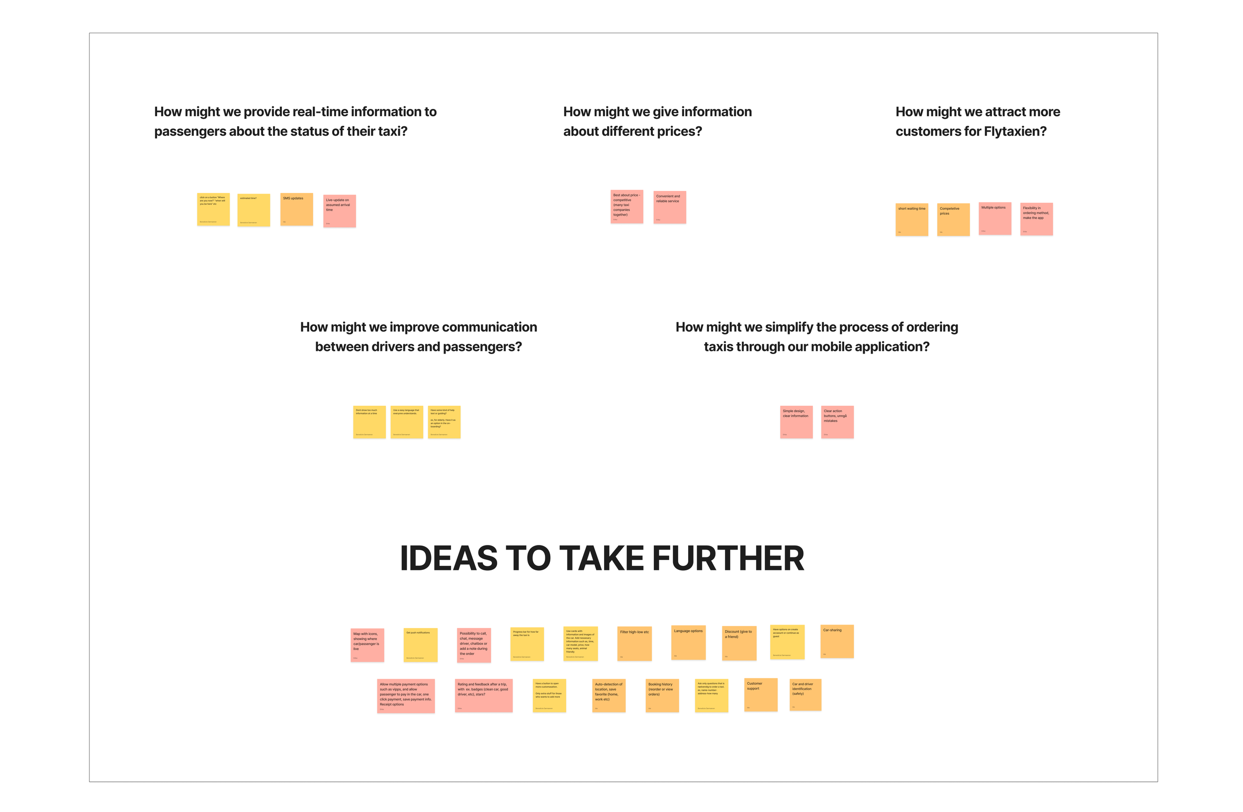
We gathering similar notes.
Then did dot voting to find our best ideas.
How might we
HMW provide real-time information to passengers about the status of their taxis?
HMW give information about different prices?
HMW attract more customers for Flytaxien?
HMW simplify the process of ordering taxis through our mobile application?
HMW improve communication between drivers and passengers?
Ideation tecniques
Dot voting

Flow charts

N.U.F test
Is the idea new, useful and feasible?
Find our ideas with the highest score.
Concept development
After we were done with our ideation workshop, we discussed and voted on our first sketches. We then developed our first digital wireframes, as low-fidelity. Task flows, user flows, information architecture, requirements were made with our top ideas fresh in mind.

IA

Crazy 8
First sketches, low-fid paper.
8 pages on 8 minutes.
Ideate

Requirements
Ideate
Prototype
Mid-fidelity wireframes
Mid fidelity wireframes
Mid-fidelity wireframes were created to run exploratory usability testing before we took our wireframes to higher fidelity.
We know from research that our users pain point is about economy, safety and time. They would probably use taxi more often if we provide information in an efficient way and make sure they experience a fluent ordering flow with the feeling of trust and conicency.
Our mid-fidelity wireframes gives the user information about where the taxi is, through a map. Users get live update on waiting time, and because we include all taxi companies, they would experience less cancellations, have a more informative desicision making about prices. We also included bageds, to help users feel safe about their chosen driver.

Usability test 1
We wanted to test the order flow, including registration and feedback, to make sure the experience is easy and understandable.
Usability test 1 gave us more insight into the users environments while using taxi apps.
Findings
The application's flow was found to be easy, quick, and simple.
3/3 of participants chose the guest log-in option instead of registering.
Some participants expressed a need for more car-size information.
A few participants mentioned that the app had too many pages.
2/3 participants liked the map function but had difficulty selecting a destination using the map.
The placement of the menu, icons, and logo needs improvement.
Note: The company has rebranded from Flytaxien to Travel Fast.

Test
High fidelity wireframes
Detailed high-fidelity wireframes was created together, after usability testing 1. The most important change was cutting down on steps in the app, removing on-boarding and sample destination “from” and “to” on the same page.
Another important change was was moving the registration from before ordering to while waiting for the taxi. We also moved the feedback stream from “after the taxi ride” to “while sitting in the taxi”.
The user would now experience a quicker ordering flow and chose to registrate and/or give a feedback when the time is right.


Prototype
Mini design system
This guide for our design is a start of a design system. It is not complete. It aims to maintain consistency and visual harmony throughout the app, ensuring a cohesive and user-friendly experience.


Usability test 2
Test
It was more important to look more closely at other aspects of our wireframes in this usability test.
We wanted to continue testing the same flow, with updated wireframes to confirm if our chances have been successful and provide users with a good user experience.
Findings
The overall design is familiar, seems clear and easy for the participants.
Choosing details flow was unclear for some participants. Change the setting about child seats, allow multiple child seats and change the year of children
Consider removing the log-in option on home page can reduce the users time on task. We should leave the space empty and keep it simple.
Option about passengers was unclear. We need to see if there is any room for improvements on the details flow about selecting passengers.
Participants did not notice the hamburger button. Consider making the menu a bit more noticeable and test it in a flow later.
Recommendations for next steps
By adopting an iterative approach and incorporating user feedback at each stage, we were able to ensure that our solutions truly address the needs and desires of our target audience. This user-centered design process ensured that our final product not only meets the functional requirements but also provides an exceptional user experience.
For the next steps we would have look further into:
Change the ‘’child seat and wheelchair’’ selection method as a drop-down menu and test the solution.
Test participants' inclination to locate the log-in/log-out functionality within the side menu.
Evaluate the visibility and effectiveness of the hamburger menu.
Introduce a new button, "No, thanks," on the confirmation page to gauge user response regarding creating an account.
Test the ordering flow by using time as a metric.
Consider the necessity of providing information about the number of seats available in the taxis. by using card sorting and A/B testing.
Reconsider the inclusion of the selecting destination on the map function and conduct testing to validate its effectiveness.
Thank you for reading.